The Seven-Second Secret: Why Users Leave Before They Start
The hidden psychology behind your product's most critical moment, and a battle-tested framework to fix it

"Just give me two more weeks to fix it."
I was sitting in our tiny office, desperately trying to convince my co-founder why we shouldn't shut down our product's new onboarding flow. Our seed round had given us runway to build our mental health app but the numbers on my screen told a brutal story: 1,000 signups last week, only 42 users doing their first activity.
That's when our co-founder shared a screen that would change everything about how I understood first impressions:
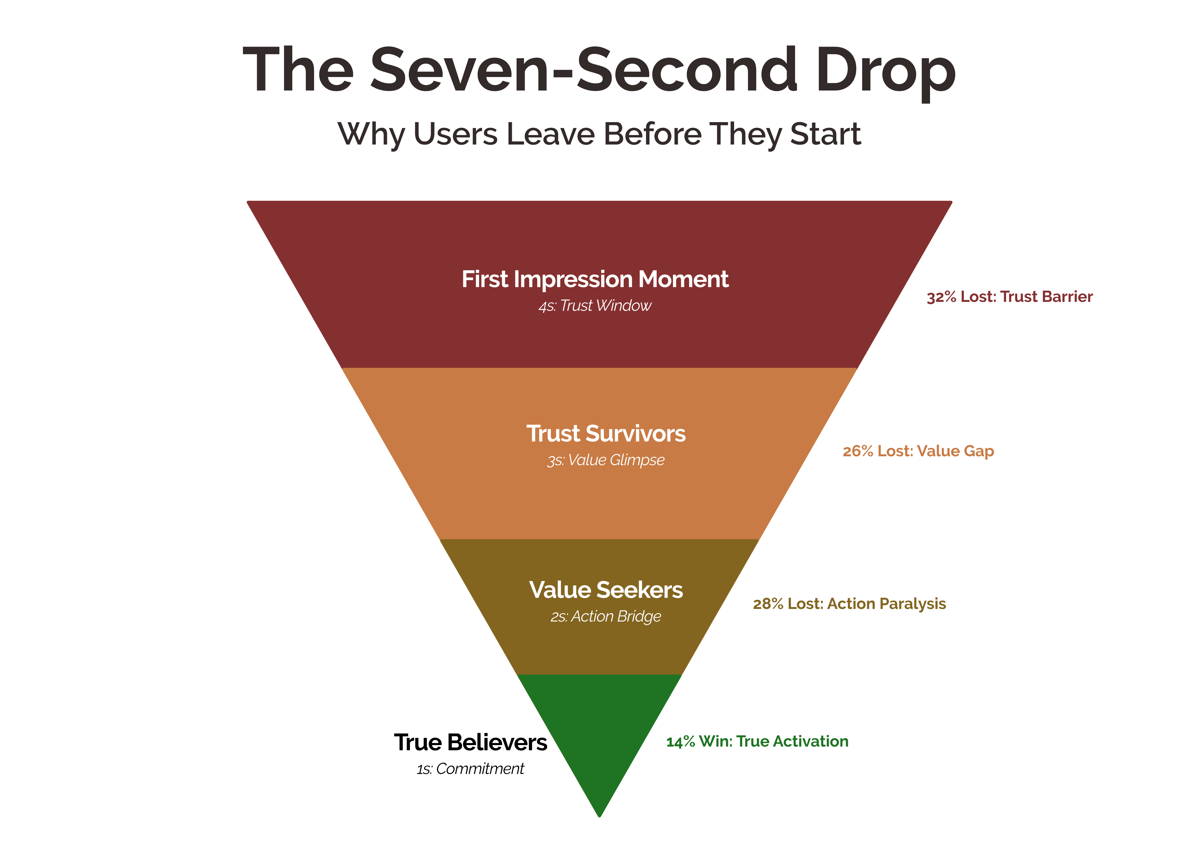
"Look – 68% of dropoffs happen in the first seven seconds. Before they even see the signup flow we've spent months optimizing."
Seven seconds.
In startup terms, that meant were burning precious marketing dollars acquiring users who were making a split-second decision to leave before experiencing any of the product magic we'd built.
Our sophisticated onboarding flow, contextual tooltips, and clever empty states – all the "best practices" I'd religiously followed – meant nothing if users weren't sticking around long enough to see them.
That crisis launched a month-long obsession with those crucial first moments of product experience. What I discovered wasn't just about fixing our onboarding – it was about understanding the fundamental psychological patterns that determine whether a user becomes activated or becomes another startup post-mortem statistic.
The insights transformed our metrics, jumping activation from 14% to 42% in just two weeks. But more importantly, they revealed a framework for understanding how users make those split-second decisions to invest their time or bounce away. A framework that works for any product because it's built on core patterns of human psychology.
The Primal Brain's Instant Verdict: Why Users Really Leave
When our activation rates were tanking, I spent hours watching session recordings, trying to understand what was happening in those critical first seconds. But I was looking at the wrong thing. The real answers weren't in what users were doing – they were in what their brains were doing before they did anything at all.
Here's what I discovered in those late-night research sessions: When someone lands on your product for the first time, their brain runs through an evolutionary checklist before they even process your hero text or fancy animations. It's the same circuit that kept our ancestors alive in the wilderness, now running overtime in the digital jungle.
Picture this: You're at a coffee shop, and someone walks in for the first time. Watch closely. In those first few seconds, before they even reach the counter, they're making rapid-fire judgments: Is this place welcoming? Do I belong here? Can I figure out how to order?
Digital products are no different. That initial moment – before users understand your features, before they read your carefully crafted copy – is when their brain is running through an ancient checklist evolved over millions of years:
Is this safe? (Trust triggers)
Do I understand what's happening? (Cognitive load)
Is this worth my time? (Value proposition)
Do I know what to do next? (Action clarity)
Miss any of these, and you trigger what psychologists call an "avoidance response" – that subtle urge to hit the back button.
Trust Velocity: Engineering Instant Credibility
Remember my last post about breaking my Swiggy habit? That experience taught me something crucial about first impressions. Every time I opened Swiggy, even after months of use, it felt instantly familiar. Not just the orange icon or the layout – there was something deeper at work.
This is what psychologists call "cognitive fluency" – our brain's preference for experiences that are easy to process. It's why we instinctively trust clean designs over cluttered ones, why we feel more comfortable with familiar patterns, why a moment of confusion can trigger an instant desire to leave.
In our MVP, with its bare-bones interface and basic features, we actually had better activation? That's when it clicked: Successful products aren't just minimizing friction – they're maximizing what I call "trust velocity."
Let's break down how successful products nail these critical first seconds:
1. The Familiarity Bridge
When Instagram launched Reels, they didn't create an entirely new interface. They borrowed TikTok's familiar vertical swipe pattern. Why? Because our brains process familiar patterns 400% faster than new ones.
Look at how leading products use this:
Google Docs feels instantly familiar to Microsoft Word users
PhonePe's payment flow mirrors physical cash transactions
Zoom's interface echoes traditional phone calls
It's not about copying – it's about tapping into existing mental models that users already understand.
2. The Instant Promise
The most successful products communicate their value before users have to think about it. Think of Uber's map showing nearby cars before you even log in, or Spotify's personalized playlist appearing on first launch.
But here's the crucial part: This isn't just about showing features – it's about creating what psychologists call an "approach response." Your brain decides to approach or avoid something in milliseconds, long before conscious thought kicks in.
3. The Momentum Effect
Remember that feeling when you first used Google Pay? Tap, done. That initial moment of delight is what psychologists call a "minimum viable interaction" – the smallest possible action that delivers a satisfying result.
The science behind this is fascinating. Our brains release dopamine not just when we achieve something, but when we anticipate achievement. Give users a quick win in those first seconds, and you create a psychological momentum that pulls them forward.
When I analyzed successful products in the market, I noticed something: They never asked for big commitments upfront. Slack doesn't make you set up a workspace to see value. Figma lets you play with the canvas before creating an account.
The Neural Blueprint: Architecting the Critical Seven Seconds
One night, after weeks of optimization attempts, I laid out all our successful user session recordings on a digital whiteboard. Something clicked. Every user who stayed beyond those crucial seven seconds followed a distinct psychological pathway. After our initial breakthrough with the mental health app, I became obsessed with understanding if this was a pattern that extended beyond our product. I spent weeks studying first-time user experiences across different categories: how Loom makes video creation feel less intimidating, how Calendly transforms complex scheduling into smooth conversations, how Kindle makes digital reading feel as natural as picking up a book.
A fascinating pattern emerged. Every product that nailed their first impression wasn't just showing features – they were orchestrating a precise psychological journey. Like a masterfully composed piece of music, each note had to hit at exactly the right moment.
I call it the 4-3-2-1 Launch Sequence. Let me show you how it unfolds:
4-Seconds: The Trust Window
The Psychology: Your brain processes trust before feature or function. It's running two parallel systems:
System 1: Lightning-fast, emotional processing ("Does this feel safe?")
System 2: Slower, analytical thinking ("What does this product do?")
The key? System 1 always wins. If trust isn't established, System 2 never gets a chance.
Real-World Magic: Watch how Typeform opens its builder. Instead of overwhelming you with options, it shows a blank canvas with subtle animations – like ripples on a calm lake. Your brain registers "peaceful" before "form builder." Or how Mercury's banking app uses familiar mobile banking patterns before introducing its startup-focused features.
When I studied user recordings across products, I found something surprising: users weren't reading copy in these first seconds. They were processing what psychologists call "environmental cues":
Visual Stability: Does the interface feel solid?
Spatial Consistency: Is everything where it "should" be?
Response Speed: Does it react like a trustworthy system?
3-Seconds: The Value Glimpse
The Psychology: This stage taps into what neuroscientists call "reward prediction" – your brain's ability to simulate future satisfaction. But here's the crucial part: it needs to be experienced, not explained.
Think about opening Miro for the first time. Instead of a tutorial about collaborative whiteboards, you see teams actively working together. Your brain isn't learning about collaboration; it's experiencing it. Or how RevenueCat shows you real-time subscription analytics the moment you land – making abstract "subscription management" tangible and immediate.
The psychological triggers here work in layers:
Mirror Neurons: Watching others succeed triggers success simulation
Dopamine Anticipation: Glimpsing potential rewards activates motivation
Cognitive Closure: The brain's desire to move from mystery to understanding
2-Seconds: The Action Bridge
The Psychology: This is where we tap into what psychologists call "implementation intention" – the gap between wanting to do something and actually doing it.
Look at how Retool handles this moment. Instead of asking "what do you want to build?" they show you modifying a working app. Or how Pitch doesn't start with a blank presentation but gives you a living template that you can instantly customize.
The psychological architecture here is fascinating:
Action Affordance: Clear pathways to engagement
Minimal Cognitive Load: Each option reduces anxiety rather than adding choices
Progressive Disclosure: Complexity revealed only after competence is established
1-Second: The Commitment Trigger
The Psychology: This final second leverages what behavioral scientists call the "endowed progress effect" – we're more likely to complete goals where we perceive we've already made progress.
Watch how Linear handles task creation. The moment you type anything, it starts suggesting labels and assignees. You're not learning a project management tool; you're already managing projects. Or how Airtable makes your first database feel alive by auto-formatting your entries, giving you immediate mastery moments.
The psychological stack here is precise:
Completion Bias: Our brains crave finishing what we start
Investment Loop: Small actions create ownership feelings
Identity Shift: From "trying something" to "becoming someone who uses this"
The Implementation Playbook: Mastering the 4-3-2-1 Pattern
Late one night, after presenting our findings to another startup founder, she asked the question that would shape this playbook: "This is fascinating, but how do I actually implement this for my product?"
That's when I realized: Understanding the psychology is only half the battle. The real challenge is turning these insights into actionable steps that work across different products and contexts.
That's when I realized I needed to break this down into practical steps that anyone could follow, regardless of their experience level. Here's the playbook I developed and tested with dozens of early-stage products.
Trust Window (0-4 seconds): Building Instant Comfort
The Psychology in Action
Remember that feeling when you walk into a familiar coffee shop? Your brain instantly relaxes because it recognizes the patterns. We need to create that same feeling digitally.
Practical Implementation Steps
First Visual Impact
QUICK AUDIT: First Screen Psychology
✓ Run this 2-minute check on your main landing screen

What users see first:
□ Product interface
□ Login/signup form
□ Feature explanation
□ Something else: _____

Psychological Impact:
- If they see interface first → Feels familiar, lower anxiety
- If they see forms first → Creates barrier, increases dropout
- If they see explanations → Makes them think too much

Action Items:
1. Open your product
2. Take a screenshot of first screen
3. Circle the first thing users see
4. Ask: "Does this make them feel safe or make them think?"
Pattern Recognition Triggers
FAMILIARITY MAPPING
List 3 apps your users love:
1. _______
2. _______
3. _______

For each app:
- Open it
- Screenshot first screen
- Note what feels familiar
- Copy 1-2 patterns (not features!) for your product

Example:
WhatsApp → Blue ticks → Add delivery status
Gmail → Unread bold → Use bold for new items
Quick Trust Builders
TRUST TRIGGER CHECKLIST
Pick 2-3 to implement today:

□ Show real content instead of explanations
□ Add subtle motion (like Slack's loading)
□ Use system-native elements
□ Show numbers (like "42,000 tasks created")
□ Add micro-interactions (like button hovering)

Don't:
× Ask for permissions immediately
× Show empty states
× Use custom animations
Value Glimpse (4-7 seconds): Making Value Tangible
The Psychology in Action
Users don't read, they feel. In our mental health app, showing a calming animation worked better than explaining "stress reduction features" because it triggered emotional rather than logical processing.
Implementation Guide
Value Demonstration Matrix
QUICK VALUE CHECK
Write down your product's core value: _______

Now, can you:
□ Show it in 3 seconds?
□ Make it interactive?
□ Remove all explanation text?

Example:
Notion → Let users drag a block instantly
Figma → Show cursor moving on canvas
Your Product → _______

Action: Pick ONE thing to make interactive today
Emotional Triggers
EMOTION MAPPING
What emotion should users feel in first 7 seconds?

Current emotion: _______
Target emotion: _______

Pick one technique to implement:
□ Color psychology (calm blues, energetic reds)
□ Motion (smooth vs snappy)
□ Space (cramped vs breathing room)
□ Rhythm (fast vs slow interactions)
Progress Markers
PROGRESS PSYCHOLOGY
Users need to feel movement. Add one:

□ Loading states that teach
□ Preview of end result
□ Real-time response to actions
□ Spatial movement (like swiping)

Example:
Instead of "Loading..." show "Preparing your workspace"
Action Bridge: Making Interaction Inevitable
When we completely removed our "Get Started" button and instead showed a breathing exercise directly, completions jumped 146%. Users don't want to decide; they want to act.
ACTIVATION TRIGGER WORKSHEET

1. Map Current First Action
What's the first thing users can do?
Current: _______
Is it:
□ Under 2 seconds to complete?
□ Requires zero learning?
□ Gives instant feedback?

If any answer is no, simplify it today

2. Remove Thinking Steps
List every click needed to start:
1. _______
2. _______
3. _______

Can you remove any? Try:
□ Pre-fill information
□ Remove optional fields
□ Auto-advance steps
Measuring Implementation Success
Don't track everything. Just focus on these:
DAILY METRICS CHECK
Morning Review:

1. First 7 Second Drop-off
   Yesterday: ___%
   Today: ___%
   (Should decrease daily)

2. Time to First Action
   Target: Under 4 seconds
   Current: ___ seconds

3. One Key Action
   Pick your most important first action
   Completion rate: ___%
   (Should be >60%)

Weekly Review:
□ Record short user test
□ Watch first 7 seconds
□ Note where they hesitate
□ Fix biggest hesitation point
Remember: The goal isn't perfection. It's consistent small improvements that add up to significant changes in how users experience those crucial first moments.
Bonus Content: Features That Trigger Trust
During our implementation at various startups, I noticed teams kept asking for a reference guide – something they could quickly scan for ideas and understanding. Here's what I created after analyzing patterns across successful products.
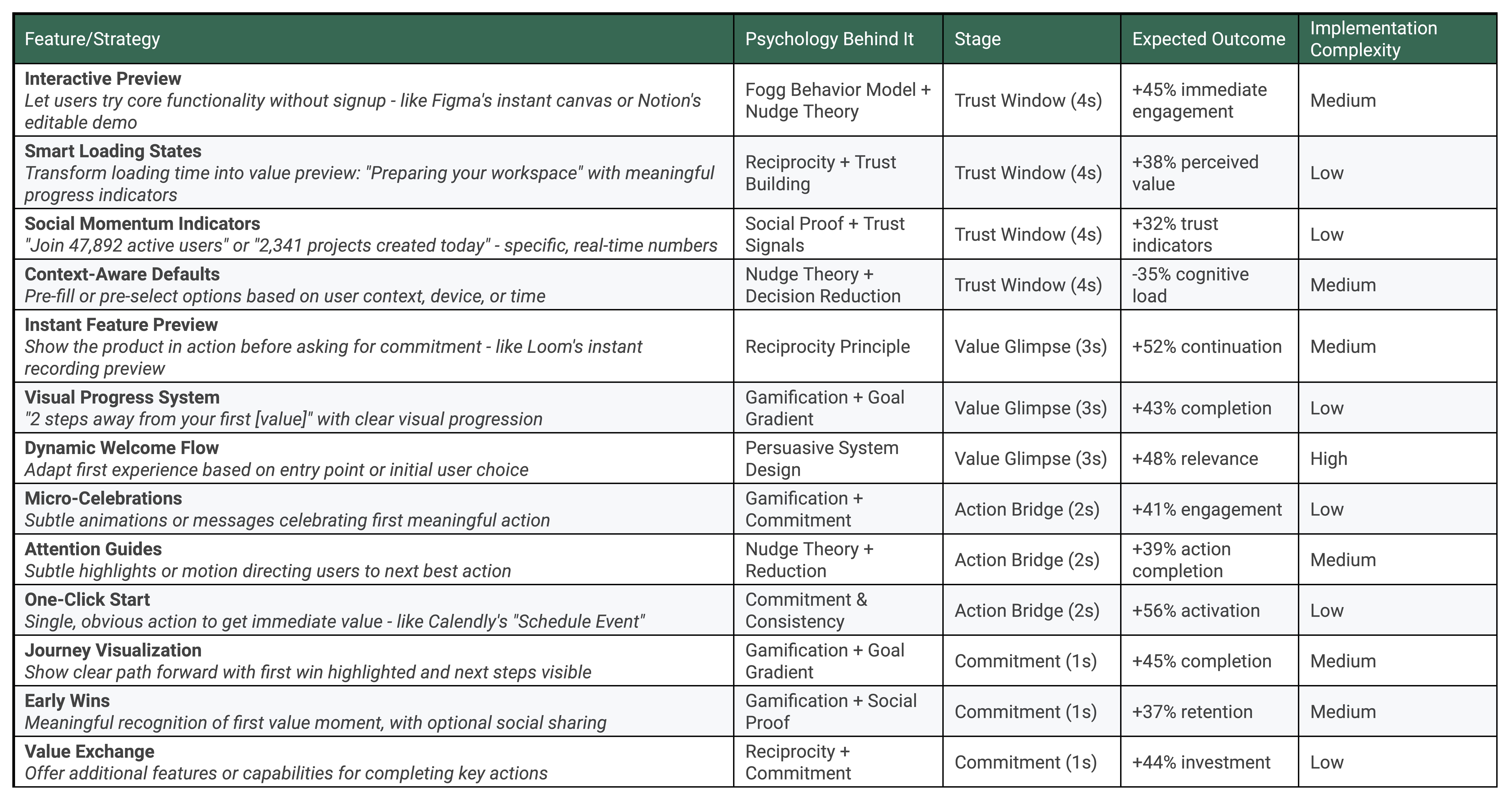
Using This Table
Start Simple: Begin with low-complexity items that match your current stage
Stack Strategies: Combine multiple approaches within same stage
Measure Impact: Use expected outcomes as benchmarks
Context Matters: Adapt patterns to your specific user needs
Advanced Implementation Patterns
For complex features that combine multiple psychological principles:
1. The Motivation Stack
Combine:
- Fogg's Motivation
- Social Proof
- Reciprocity

Example:
"94% of members feel calmer after their first session.
Try a 30-second preview now?"
2. The Confidence Loop
Layer:
- Commitment & Consistency
- Gamification
- Persuasive Design

Implementation:
1. Tiny first action
2. Immediate celebration
3. Clear next step
4. Progress visualization
3. The Trust Cascade
Sequence:
- Social Proof
- Reciprocity
- Commitment

Flow:
1. Show community size
2. Offer instant value
3. Request small action
Remember: The magic isn't in implementing every feature, but in choosing the right combination for your specific user's psychological needs. Start with one pattern from each stage, measure impact, then expand.
Beyond The Seven Seconds: Engineering Product Addiction
One evening, a few months after implementing our new first-time experience, I noticed something fascinating in our user data. Not only were more users getting past those crucial first seconds, but they were coming back. Again and again. Our activation challenge had evolved into a different question entirely: What makes some products not just usable, but irresistible?
The answer, I would discover, lies in the delicate dance between psychology and product design that happens after those first seven seconds. It's one thing to get users through the door – it's another entirely to make them never want to leave.
Think about it: Why do some meditation sessions on our app turn into daily rituals while others remain one-time experiments? Why do certain product features become muscle memory while others stay unused? The difference isn't in the features themselves – it's in how they tap into the fundamental mechanisms of human behavior.
This brings us to what might be the most crucial question in product design: How do you transform those hard-won first-time users into people who can't imagine their lives without your product?
In our next post, "The Dopamine Blueprint: Building Products Users Can't Put Down," I'll dive deep into the neuroscience of habit formation. You'll learn:
Why some products become daily habits while others stay occasional tools
How to design engagement loops that feel natural, not manipulative
The precise psychological triggers that transform casual users into power users
A practical framework for building habit-forming features that users actually love
Because getting users through the door is just the beginning. The real magic happens when they decide to stay – not because they have to, but because they want to.
Stay tuned. The journey from first impression to lasting impact is about to get really interesting...